How to shoot and edit better black & whites
Black and white photography has a style and aesthetic all of its own. Award-winning photographer Nick Rains explains some of the key elements to consider when shooting and editing in this most striking of styles.
I love black and white photography. If it wasn’t for the demands of my clients I’d only work in monochrome and publish all my books filled with B+W images. Take a look at Sebastião Salgado’s Genesis book and luxuriate in over 500 pages of gorgeous black and white imagery of the highest calibre – inspirational to say the least!
But why? What is it about monochrome imagery that appeals so strongly in a time of amazingly rich and technically perfect colour photography? Prints have never been so vibrant, and even TVs can now show colours that even exceed what the eye can see.

As I see it, there are three principal factors at play here.
Firstly, there’s nostalgia for times past. Black and White was the only game in town for much of photography’s early history. Colour photography only became mainstream in the 1930s with Kodak’s “You take the photo, we do the rest” slogan but colour photography had been possible since the late 19th century.
In the beginning, colour photography was really tricky and so the vast majority of photography from the 1870s onwards was based on a monochrome emulsion with film plates being developed by hand and then printed, by hand too, in darkrooms.
This strong connection with photography’s heritage resonates with some photographers - some old techniques like tintypes and hand-coated glass plates are being revived, not only as a means of distinguishing one’s work from everyone else’s, but also for those who enjoy the process as much as the end result.

Secondly, there’s the ‘artisan’ angle. On some level, black and white photography is associated with ‘hand-made’. Or to reverse this viewpoint, colour photography has always been a much more mechanised process; back in the 1960s for example the image making process was reduced to quite literally the pressing of the shutter button.
The prints were subsequently made by machine with automatic adjustments for colour and exposure. This is certainly convenient, but lacks any further creative input from the creator of the photo.
Traditional B+W on the other hand has almost always been a totally manual process and here’s the key point; each print was thus effectively unique. Look at Ansel Adams’s work - his processing techniques were hugely technical and the darkroom work he did on his prints was complex and almost impossible to reproduce. Hence each print could be considered an one-off original and all the more desirable for it.
Contrast that with mechanised colour photography, and especially modern digital photography, and it’s easy to see why even a tenuous connection with hand-made craftsmanship is highly valued.

The third aspect of B+W that I think makes it so appealing is that it’s essentially an abstract view of the world whilst colour photography strives to be an attempt at an accurate representation of the world. Once you head away from accuracy (whatever than even means) into the realms of abstraction, there are so many creative options open to you.
Black and white is not intrinsically ‘realistic’ so it sits nearer to other forms of art, like painting or sculpture, which have no need to even try to be accurate depictions of the world we see. Thus I would argue that a good B+W image is potentially more creative than a colour image because you cannot rely on the colours of the subject to carry the image, instead you need to be super-aware of tone and form, something that does not come naturally to most people.
Tone and form
‘Tones’ are the shades of grey that make up an image and ‘Forms’ are shapes defined by edges, which are themselves defined by tones. Edges are always boundaries between light and dark, and this includes textures which are also defined by differences in tone, just more subtly.
The interplay between Tone and Form makes the image work or not; successful images tend to include a full range of Tones from deep back to almost paper-white which at the same time define visually interesting Forms.
It’s worth stating that whilst colour plays no direct part, there is a subtle exception in that whilst an image might be monochrome, that does not mean it has to be a perfectly *neutral* grey. Warm-toned monochrome images, or cool-toned monochrome images can add a very subtle appeal to a photo.

Some images can be split-toned which means, for example, that the shadows might be a bit cool and the highlights a bit warm. Done correctly, this can add a very slight sense of three-dimensionality to the image.
Different photographers have different preferences with regard to colour toning. Personally I like a slight warm tone and most of my favourite images have a slight warmth to them. But that’s just me!
Colours and greyscales
The real world is made up of colour, and most cameras capture colour in some fashion. Monochrome imagery relies only on shades of grey, so at some point we need to translate those captured colours into different greyscale values.
This can be done in-camera - most modern digital cameras have a B+W ‘mode’ - but it’s not very controllable and at best you might have a high contrast setting plus some other ‘creative filter’ settings.
For the best possible results, photographs should be captured in raw and then converted in-post to monochrome using Lightroom or, best of all, Photoshop, which offers some seriously powerful B+W conversion techniques.
The key here is to understand that in all conversions, a particular colour (Hue) will be translated to a specific grey value. A blue sky, by default, will be converted to a medium to dark grey, skin tones to a pale grey, green grass to a medium grey, yellow flowers to a light grey etc.
The question is: precisely which grey values do specific colours convert to? Controlling this is one of the secrets of good B+W imagery, at least from a tonal point of view - it’s still got to be an interesting photo!
To understand the question properly, you need to understand a little bit about how we see.
Computers work with numbers in a very literal sense; we, on the other hand, subjectively ‘experience’ colours more than we objectively ‘measure’ them. This makes it difficult for computers to emulate colour vision and there are a large variety of what are known as colour appearance models (CAMs) that cater for this mathematically.
For our purposes RGB is the most familiar since that’s how digital cameras ‘see’ and it’s also similar to our own colour vision - the ‘tristimulus model’.
There is another CAM that is more useful for B+W conversions – the HSL model. That’s Hue, Saturation and Lightness (a.k.a. the HSB model). The power of this model lies in its capacity to separate Hue from Lightness and allow adjustments of them independently, something hard to do using the RGB model.
For B+W conversions this means that we can choose what greyscale value any particular Hue is translated to by varying it’s brightness. For example, a blue sky will convert to a value of grey, let’s say 50%. If we change the Lightness of the blue Hues we can translate the blue sky to different greyscale values so that we could, for example, emphasise the tonal difference between white clouds and blue sky, adding impact and drama.
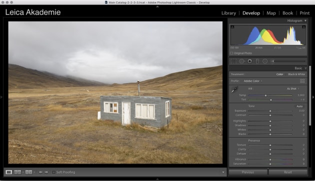
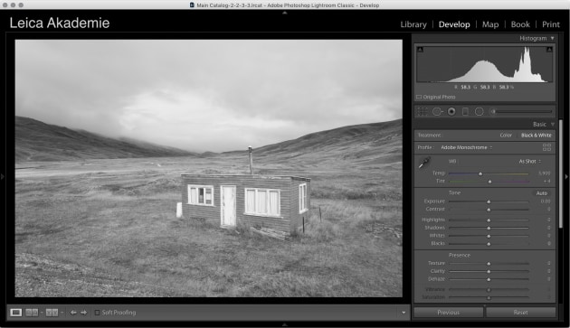
This HSL model is what’s being using when you make B+W conversions in Lightroom - open up the HSL /B+W pane in the Develop pane and you’ll see a whole load of sliders controlling the Hues, Saturations and Lightnesses of eight different colour (hue) ranges.
With B+W selected in the Basic pane, these change to sliders controlling only the Lightness of those same eight different Hues such that you can adjust the lightness or darkness of those colours as they are converted to greyscale values. Lower the Blue slider and your blue skies will darken but the other colours remain unaltered. This is very powerful and allows some very subtle control of which colours convert to which greyscale values.
Here’s an example which should make this point clear:


The blue post and the red bowser in the image above are very different in the colour version - but when converted to B+W with a single click the blues and the reds end up as very similar greyscale values - have a look at the image directly below the colour image. The result is the image loses a lot of tonal contrast.
Compare it to the other two versions below where the reds and blues have been adjusted separately.


This loss of colour contrast is what we are controlling when we make these conversions and there are many ways to do it, from simple techniques like this to advanced techniques using blending modes and masking in Photoshop. Regardless of the method, the key is to control the contrast, such that the perceived colour contrast is maintained, or even strongly emphasised, and the image looks punchy and strong.
A simple black & white workflow
If you're looking to convert your images from colour to black and white, a few extra steps in post production can help you create much more eye-catching images. Shoot raw and use a program like Lightroom, Capture One Pro, and Photoshop to make the conversion. Here's a simple Lightroom workflow.
STEP 1

STEP 2

STEP 3

STEP 4

About the Author: Nick Rains has been a professional photographer for over 30 years, starting off in the UK with sports and commercial work before moving to Australia in 1990. Since then he specialised in landscape work, criss-crossing the country on assignments for many large book and calendar publishers including Explore Australia, Penguin and Australian Geographic. Nick still enjoys packing up his trusty 4WD and heading off into the wilderness for weeks at a time, driving tens of thousands of kilometres and camping out under the stars in a never ending quest for the perfect light.
In 2002 Nick was named Australian Geographic Photographer of the Year and in 2014 Nick won the AIPP Travel Photographer of the Year. In addition to shooting book and magazine assignments, Nick also runs the Leica Akademie in Australia which instructs other photographers in the finer points of camera use and image making. See more of his work at nickrains.com.
Article first published in Australian Photography, September 2019.


